Quenbor: A Fresh, Modern Display Font That Actually Works
It was 10:47 a.m., and I had just opened a blank brand board for a local ceramicist’s rebrand—no mood board yet, no color palette locked in, just a quiet screen and the weight of expectation. I scrolled through my display font library, skipping past the overly ornate, the dated, the ones that looked great in isolation but collapsed under real-world use. Then I dropped Quenbor onto the logo draft. Instantly, something clicked—not because it was loud or flashy, but because it felt right: clean, confident, quietly energetic.
What Quenbor Really Feels Like in Practice
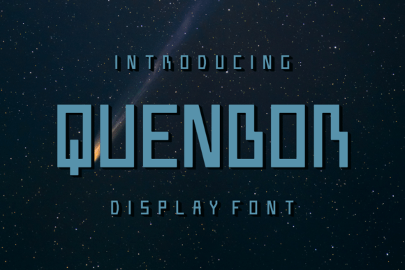
Quenbor is a contemporary display font with subtle geometric warmth—think rounded terminals, balanced x-height, and open counters that breathe even at smaller sizes. It’s not minimalist to the point of sterility, nor playful to the point of distraction. Its personality sits comfortably between “curated boutique” and “thoughtfully modern”—the kind of typeface that signals intention without shouting. The letterforms have gentle contrast and soft curves, giving them approachability, while the consistent rhythm and spacing lend professionalism. It’s not a script, not a sans serif, not a slab—it occupies its own lane: a premium display font built for presence, not paragraphing.
Where It Shines (and Where It Doesn’t)
I tested Quenbor across six touchpoints in that ceramic studio project: logo lockup, brand board headers, product label mockups, business card front, website hero section, and Instagram story templates. Here’s what stood out:
- Logo design: Excellent at scale—even at 24pt on a small enamel pin mockup, Quenbor retained legibility and character. Its uppercase ‘Q’ and ‘B’ add quiet distinction without gimmicks.
- Packaging & labels: On matte ceramic tags and kraft paper stickers, Quenbor held up beautifully. The medium weight gave enough ink density for print clarity, and its width allowed short names (“Clay & Co.”) to sit balanced and centered.
- Web & social: In a website hero banner (64px), it created strong visual hierarchy without competing with imagery. On Instagram posts, it worked best for headlines and short quotes—not captions or bios.
- Business cards: Printed crisply on 300gsm uncoated stock. No blurring, no awkward kerning traps. The lowercase ‘a’, ‘e’, and ‘s’ read cleanly even at 14pt in fine-print credits.
But—and this matters—I didn’t use Quenbor for body text, email newsletters, or legal disclaimers. It’s not designed for extended reading. At under 12pt, especially in long paragraphs or low-contrast UI contexts, it begins to soften visually. And while it’s expressive, it’s not whimsical enough for children’s brands or rustic farmhouse aesthetics—those call for something more textured or hand-drawn.
Smart Pairings and Realistic Font Pairing Notes
Quenbor thrives when paired intentionally. I landed on two reliable combinations during the project:
- A warm, humanist sans serif like Inter or Manrope for supporting text—clean enough to recede, friendly enough to match Quenbor’s tone.
- A delicate serif like Cormorant Garamond (light or regular) for editorial touches—say, a quote on a product insert or an “About” page subhead. The contrast feels intentional, not jarring.
It does not pair well with heavy grotesques (think Helvetica Bold), ultra-thin fonts, or high-contrast scripts—those clash tonally. And while Quenbor has stylistic alternates (a few swash capitals and contextual ligatures), I only used one: the alternate ‘R’. It added just enough nuance to the logo without tipping into novelty.
Licensing, Formats, and What You’ll Actually Get
Quenbor ships as OTF and WOFF2 files—so it’s ready for both desktop design apps and web use. There are three weights (Light, Regular, Bold), each with full Latin character sets, basic diacritics, and standard OpenType features (ligatures, oldstyle figures, small caps). No multilingual extensions beyond Western European languages—but that covers most small business needs. Crucially, it includes a commercial license: you can use it on client work, packaging, merchandise, and websites—as long as you’ve purchased the appropriate license tier. Always double-check the license before dropping it into a Shopify theme or selling branded templates.
A Practical Note Before You Commit
Don’t just preview Quenbor on a font site. Pull it into your actual workflow: drop it into a Figma file next to your brand colors, set it as your header style in a Webflow test page, print a business card mockup at 100% scale, or paste it onto a product label template in Illustrator. See how it behaves with your specific contrast ratios, paper stocks, and screen resolutions. Fonts live in context—and Quenbor proves its value not in isolation, but where it meets real constraints: tight margins, ambient light, tactile materials, and human attention spans.
At the end of the day, Quenbor isn’t about being “trendy.” It’s about being reliably expressive. It gives a brand voice without demanding all the attention. It looks fresh without feeling disposable. And for designers balancing craft, clarity, and client expectations—that’s rare. Whether you’re refreshing a neighborhood café’s signage or building a handmade shop’s digital presence, Quenbor earns its place not as decoration, but as deliberate, working typography.