Qharon: A Display Font That Commands Attention
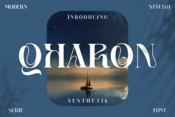
First glance at Qharon? It doesn’t whisper — it leans in, confident and sculpted. This is a display font with presence: sharp terminals, deliberate contrast, and a subtle architectural rhythm that feels both contemporary and grounded. The uppercase letters carry weight without heaviness; the lowercase has restrained personality — not playful, not cold, but quietly authoritative. It’s the kind of typeface that suggests intentionality before a single word is read. If you’re building a brand that values clarity, craft, and quiet confidence — not flashiness — Qharon lands like a well-placed accent wall: understated, but impossible to ignore.
Where Qharon Earns Its Place in Real Projects
In logo design, Qharon shines when simplicity and memorability are non-negotiable. I’ve used it for boutique skincare labels and indie publishing imprints — always as the primary mark or lockup anchor. Its letterforms hold up beautifully at small sizes on product tags and embossed packaging, provided you avoid ultra-thin weights in physical production. For posters and flyers, it performs best with breathing room: one bold line of copy, no more. It’s not built for paragraphs — and trying to force it there undermines its strength.
Social media graphics benefit from Qharon’s visual punch. On Instagram carousels or Pinterest pins, it cuts through noise without shouting — especially in dark mode or over textured backgrounds. I’ve paired it with neutral sans serifs (like Inter or Manrope) for body text, letting Qharon own the headline while keeping hierarchy clean and scannable. For wedding invitations or artisanal product labels, its refined geometry reads as premium without leaning into cliché elegance — a real win for brands avoiding ornate script or sterile minimalism.
As a digital product font, Qharon works reliably in website headers and hero sections — but only where loading performance allows. It’s not a web font you’ll serve broadly across an entire site. Think one impactful banner, not navigation or blog titles. In Canva templates and Cricut projects, it scales cleanly up to 300pt, holds crisp edges in SVG exports, and aligns predictably with grid-based layouts. For printable design — think greeting cards or limited-run zines — it prints with satisfying density and ink control, especially in medium and bold weights.
Where to Use Qharon With Intention — Not Assumption
Qharon excels in short-form, high-impact contexts: brand marks, taglines, chapter headings, pull quotes, merchandise chest logos, and social post headlines. It’s strongest when set in all caps for maximum structural cohesion — though the lowercase has charm in carefully spaced phrases like “hand-poured” or “locally sourced.” Avoid using it for body copy, captions under 14pt, or multi-line subheads where rhythm breaks down. It’s not a workhorse — it’s a spotlight.
This isn’t a font for “friendly” or “approachable-first” brands unless that friendliness is rooted in expertise — think a sommelier’s newsletter, not a kids’ app. It also struggles in low-resolution environments (think older email clients or tiny mobile notifications), so test early. And while it reads clearly at 24pt+ on screen, don’t assume it’ll translate to legibility on a 10pt product label without mockup validation.
How Qharon Shapes Perception — Beyond Aesthetics
Typography is never neutral. Qharon subtly signals craftsmanship, attention to detail, and a preference for substance over trend. That affects audience trust: readers associate its precision with reliability, especially in editorial design or premium packaging. In brand identity systems, it strengthens recognition by offering a distinct silhouette — not just a style, but a shape people begin to recognize across touchpoints.
But it also demands consistency. Because Qharon carries such visual weight, inconsistent spacing or mismatched weights across assets dilute its impact fast. I’ve seen clients lose cohesion by mixing Qharon Bold with a competing display font in their social feed — the result felt unsettled, not dynamic. Stick to one weight family (Light to Bold), limit color variations (black, deep charcoal, or a single accent tone), and maintain generous letter-spacing — especially in uppercase settings.
Practical Designer Notes You’ll Actually Use
- Always test in black and white first. Qharon’s contrast and structure shine without color — if it falters here, it’ll falter everywhere.
- Check readability at actual size. Set your intended headline size on a printed mockup or physical label proof — screen previews lie.
- Compare uppercase vs. lowercase in context. Some projects need the formality of caps; others gain warmth from mixed case — but only if spacing and x-height alignment support it.
- Review spacing meticulously. Default tracking often needs tightening for headlines, loosening for short phrases. Kerning pairs like “To”, “AV”, and “Wa” deserve manual attention.
- Test pairings deliberately. Try Qharon beside a warm serif (e.g., Literata), a neutral sans (e.g., Söhne), a relaxed script (e.g., Bree Serif), and a tactile handwritten font (e.g., Lora). Notice where contrast supports — and where it competes.
- Confirm commercial licensing upfront. Qharon is a premium font, and its license covers digital products, client work, and resale assets — but verify terms for extended use (e.g., SaaS platforms or unlimited template distribution).
Qharon isn’t a “safe” choice — but it’s a considered one. It rewards restraint, rewards testing, and rewards designers who treat typography as part of the strategy, not just decoration. Used with discipline, it elevates brand identity without overshadowing message. Used carelessly, it becomes visual noise. That balance — between power and precision — is exactly why it’s earned space in my core display font toolkit.